Drake — Software Renewals

Existing Drake customer's web site for annual software renewal.

Roles

  • UX Design
  • Researcher
  • Page Copy
  • Information Architecture

Visit Drake Website

Drake Software Renewal Website

My role Sole designer and researcher for the Professional Product Management team, defining the IA and interaction model, writing key page copy, and partnering with the PM to ship in time for renewal season
Scope PM + engineering | Shipped ahead of renewal season | Product selection and checkout flow, discount presentation, progressive disclosure patterns
Challenges and constraints Tight delivery window, strong brand constraints, multiple products competing for attention, and a user base that wanted a fast “same as last year” path with minimal decision overhead
Impact Streamlined product selection with progressive disclosure, improved clarity of discounts and product details, and iterated through quick usability sessions to reduce friction in the renewal flow
Skills demonstrated Information architecture, progressive disclosure, UX writing for commerce clarity, usability testing, decision-friction reduction, delivery under tight timelines

Making annual renewal a quick and easy process.

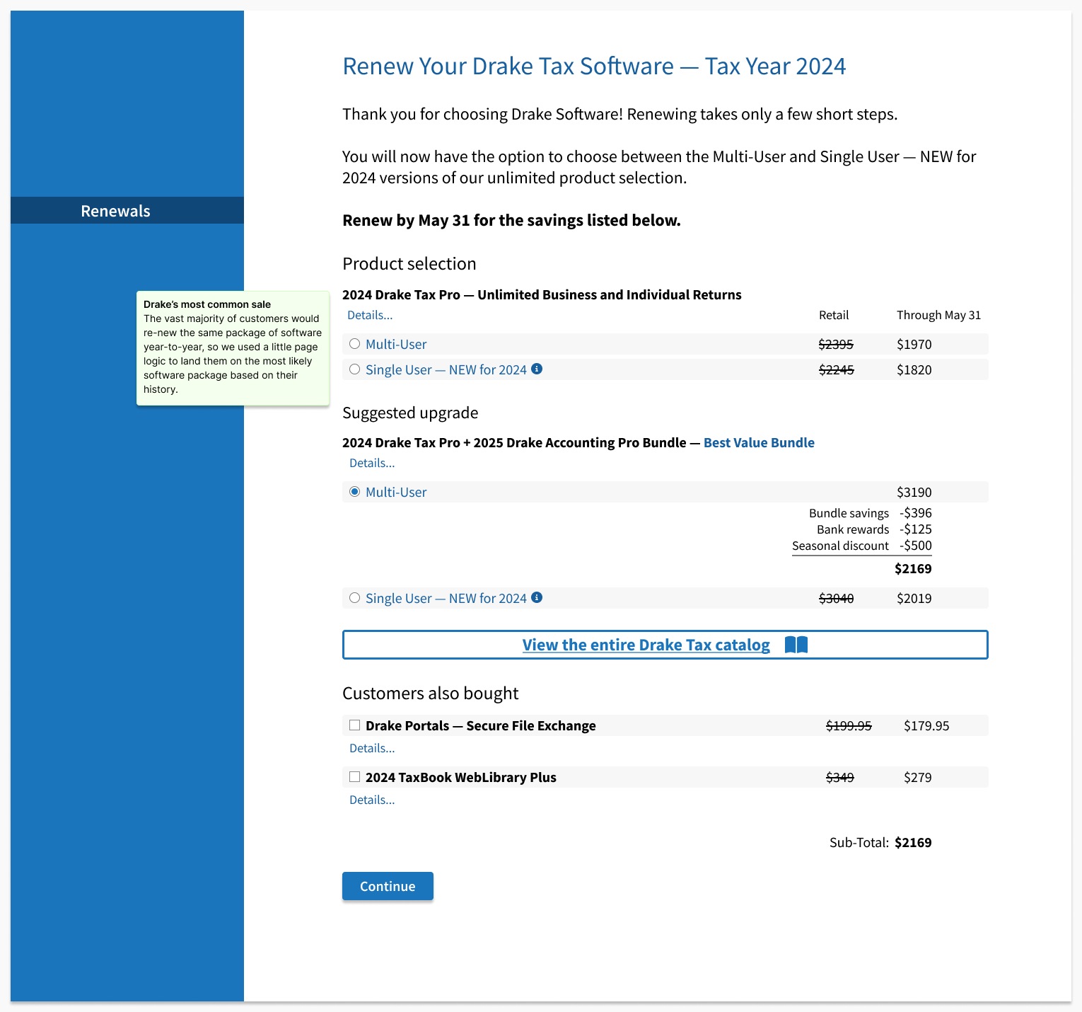
Drake Software offers existing users significant discounts for renewing their software immediately after the tax season ends.

For this initiative, I focused on three key objectives:

  • Maintain Brand Consistency: Ensuring the design aligned with the established look and feel of the site
  • Optimize Information Delivery: Displaying multiple products within the viewport without overwhelming the user
  • Enhance Usability: Using progressive disclosure to present relevant information at the right time

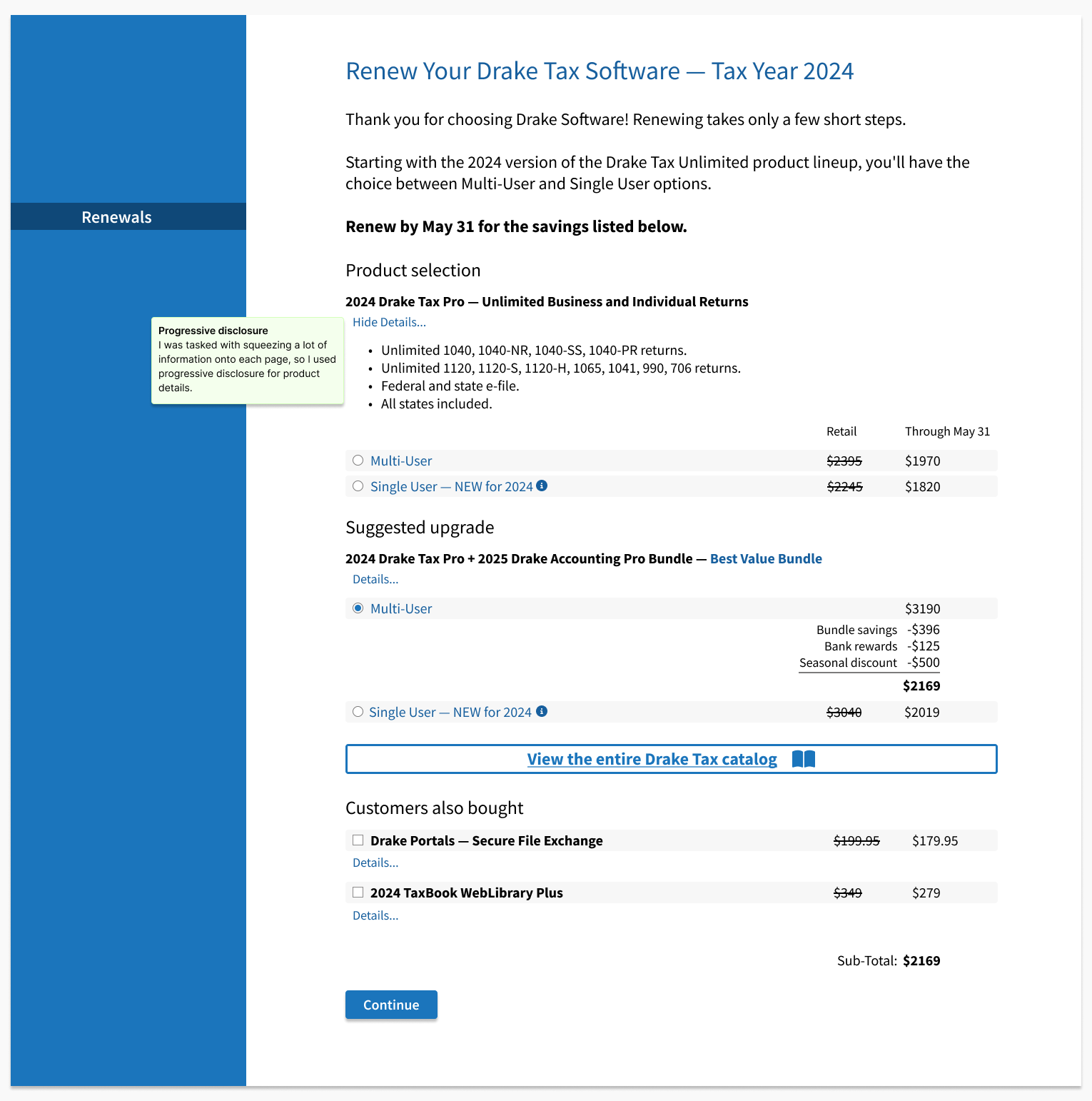
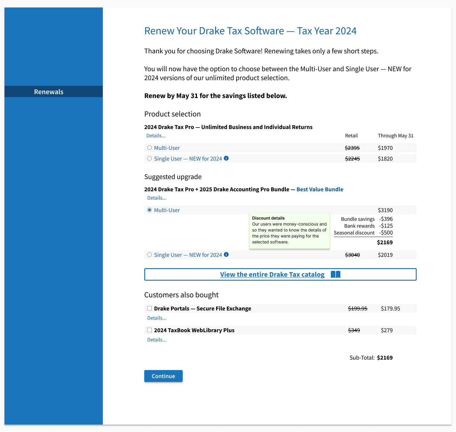
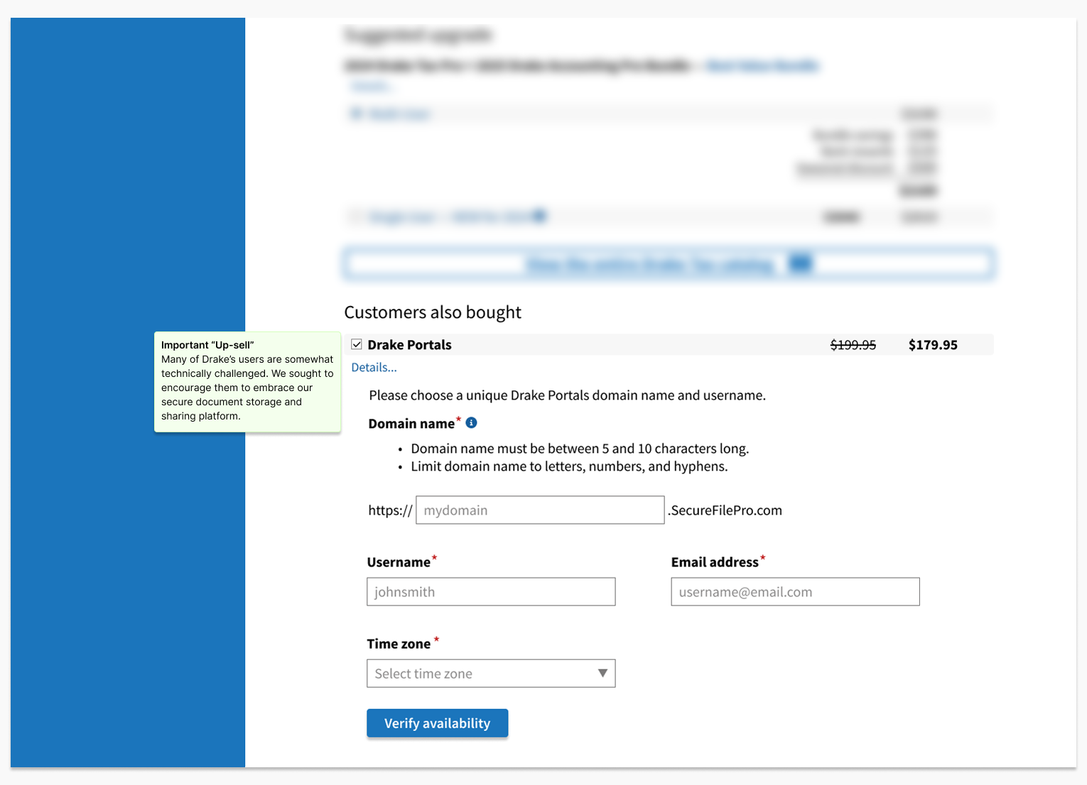
My primary goal was to keep the page layout simple and remove friction from searching for and selecting renewal options, so users could complete the process quickly and confidently.

Key decisions
Summary: progressive disclosure, repeat renewal fast path, discounts in context
Use progressive disclosure to reduce choice overload
DecisionStructured selection so users saw only what they needed at each step instead of a flat list
TradeoffA slightly longer interaction path in exchange for less cognitive load and fewer wrong turns
WhyUsers were stalling when comparing bundles and navigating details
ResultFaster selection behavior and improved funnel outcomes during the renewal window
Surface a "same as last year" path as the default
DecisionMade repeat renewal the simplest option by surfacing the prior-year bundle early
TradeoffLess emphasis on exploration in exchange for speed for the main use case
WhyUsers wanted a fast, minimal decision renewal experience
ResultReduced stalling and fewer backward navigations during selection
Explain discounts at the decision point, not after
DecisionPut discount details inline where the user commits and tightened copy to prevent misinterpretation
TradeoffMore explanatory text in the flow instead of a cleaner but less informative screen
WhyPricing confusion kills checkout confidence and creates support noise
ResultFewer pricing questions and better comprehension in quick usability checks

Outcomes
Summary: +11% new software sales, +8% renewal sales, fewer pricing questions
+11%
New software sales
+8%
Renewal sales
Fewer
Pricing questions
  • Renewal conversion
    Baseline: Checkout completion was weak enough that the flow became a top priority ahead of renewal season
    Change: Progressive disclosure for selection and clearer discount presentation at the decision point
    Evidence: Sales funnel results during the renewal window (+11% new software, +8% renewals)
  • Time to select
    Baseline: Users stalled when comparing bundles and navigating details
    Change: Consolidated options and surfaced a "same as last year" path
    Evidence: Usability observations plus click path review
  • Discount clarity
    Baseline: Users asked "what am I getting" questions before committing to checkout
    Change: Discount information moved inline where the decision is made
    Evidence: Short usability checks confirmed users could explain the offer before purchase
What changed in the product
  • Progressive disclosure replaced a flat product listing
  • Discount information moved inline rather than living in detail screens
  • The default renewal path surfaced the prior-year bundle for fast repeat renewal
How we measured

Funnel analytics across the renewal window, supplemented by moderated usability sessions focused on selection and discount comprehension

I led design and research for the renewal flow, partnering with Product to prioritize the highest-friction steps. We ran brief usability sessions with current Drake users and iterated quickly, shipping in time for the renewal window.

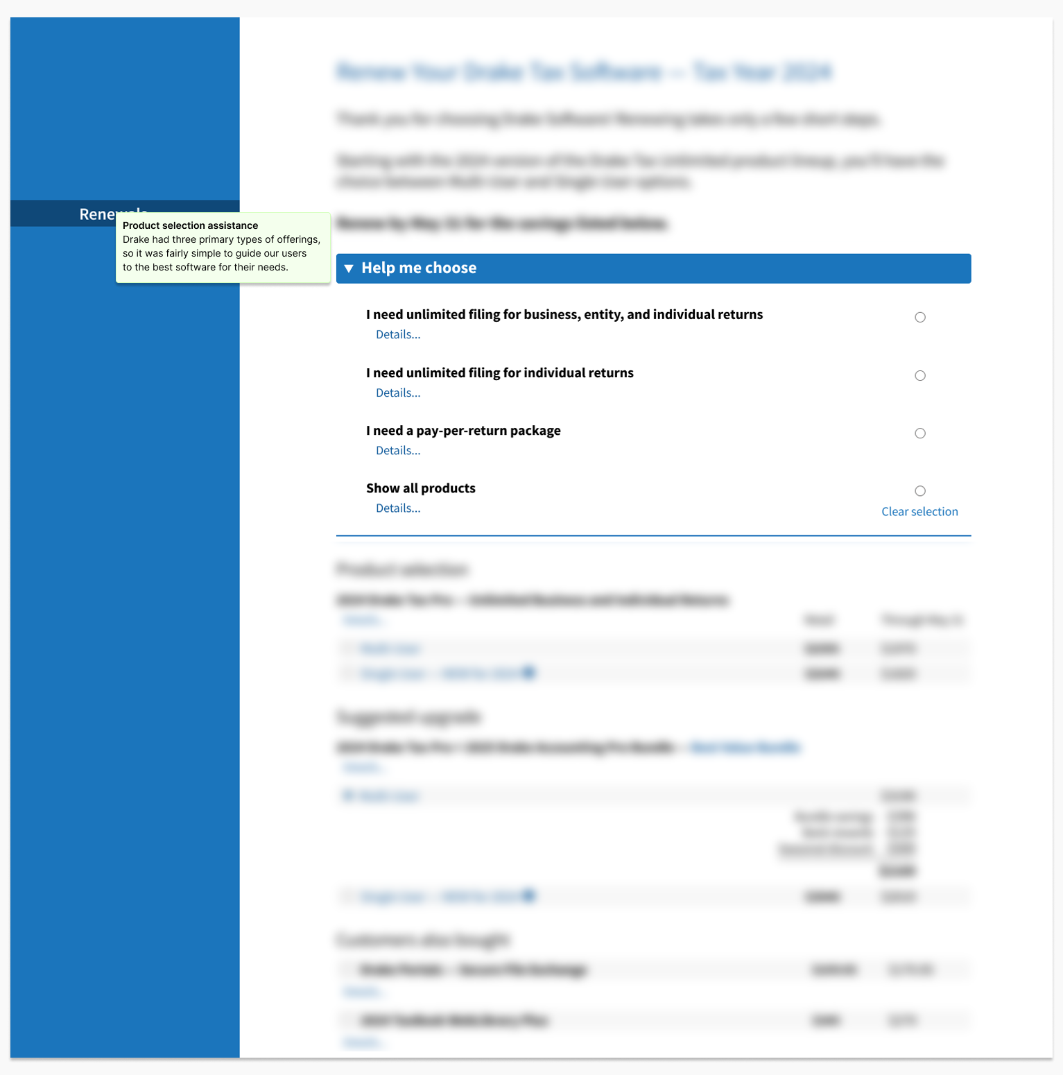
“I just want the same software I had last year...”

— Drake Desktop Pro User

Get in touch

I'd love the opportunity to discuss how my skills and experience can align with and support your organization's goals.

Contact me