Drake: Legacy Desktop Tax
Modernizing a workhorse desktop app without disrupting the people who depend on it.
Drake's legacy desktop product was mid-migration from Power Basic to C# when I joined the effort. That transition created a practical opportunity: rather than simply porting existing screens, we could address longstanding usability problems at the same time.
Requirements often came in thin, so I worked quickly to clarify intent with the engineering lead, then focused redesign efforts on the screens most likely to reduce support calls. The goal was to simplify data presentation and task flows in ways that felt like a natural evolution to a user base that knew the product deeply and didn't welcome disruption.
Key decisions
Outcomes
- Support load — A cluster of high friction screens consistently generated support calls during tax season. Modernized the most problematic screens during the Power Basic to C# migration. Confirmed through support call driver review and guidance from the Drake support lead.
- User error rate — Dense, poorly organized screens led to mis-entries and missed steps. Simplified hierarchy and tightened layout to make "what matters" obvious. Evidenced by internal walkthrough observations and QA defect patterns.
- Workflow clarity — Next actions were implicit and users relied on prior training to proceed. Steps and transitions made explicit in redesigned screens. Confirmed through rapid internal validation sessions during sprint delivery.
- High friction screens redesigned with cleaner data presentation and clearer task structure
- Legacy patterns replaced with C# equivalents that reduced clutter and surfaced next steps
Support call driver review to identify target screens, followed by rapid internal prototype validation to confirm directional improvement before shipping
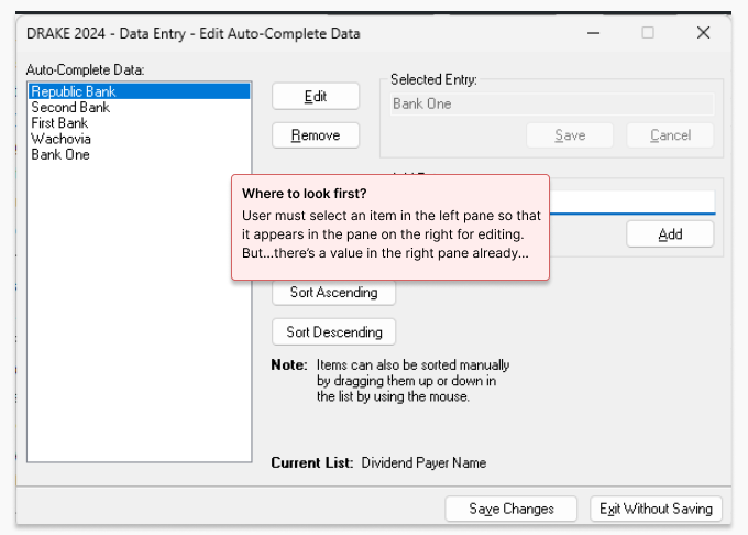
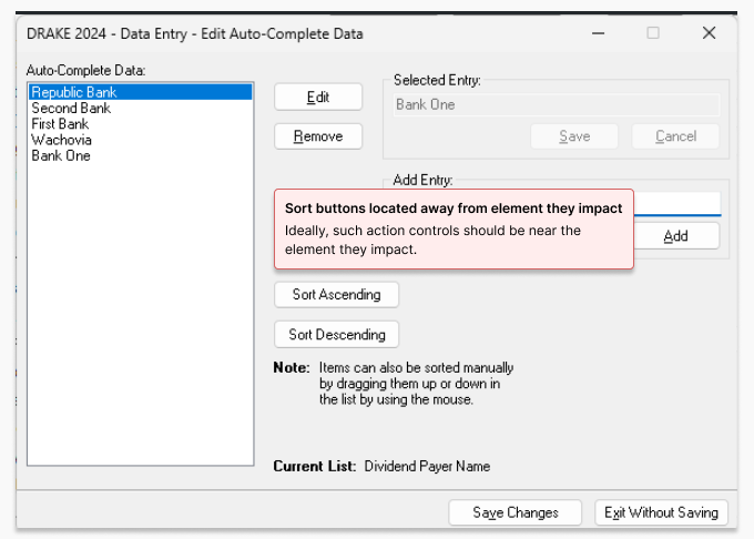
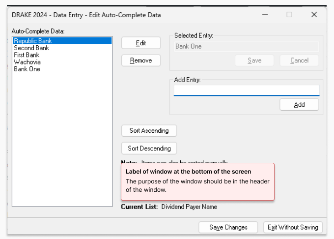
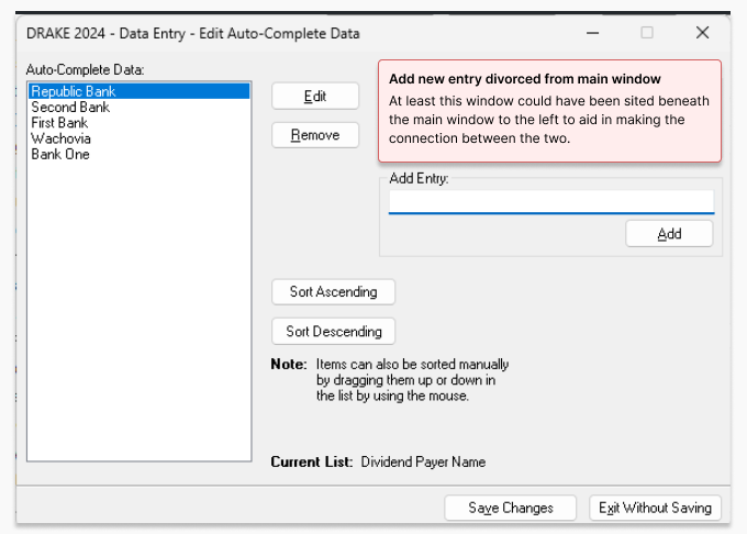
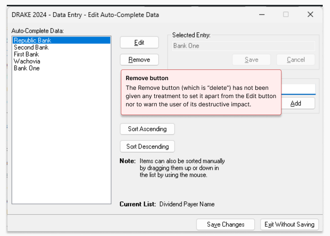
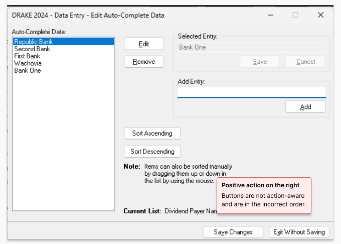
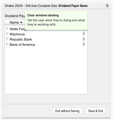
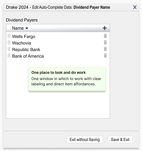
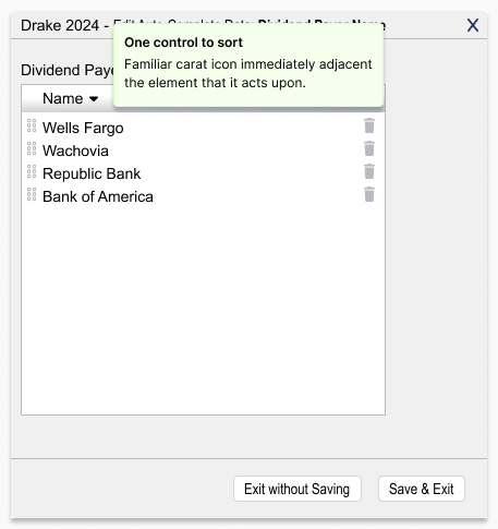
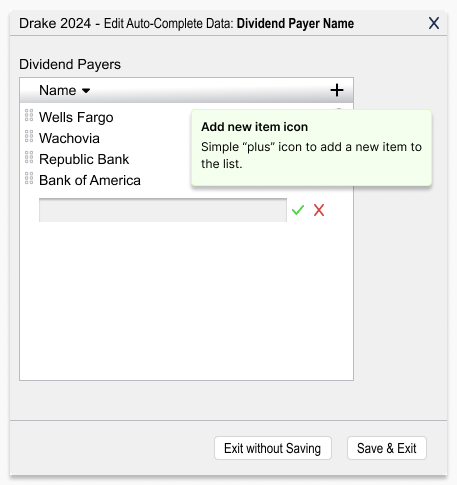
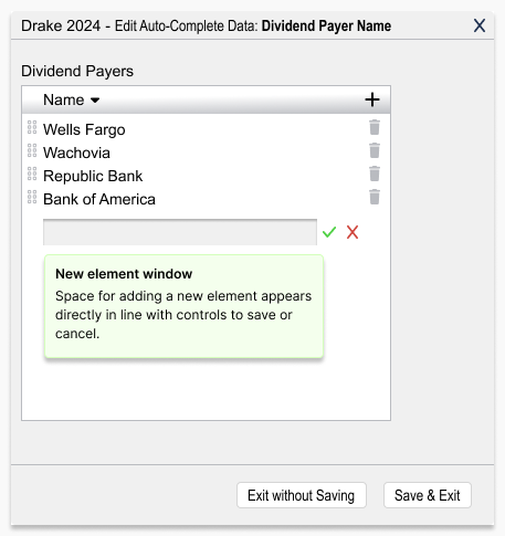
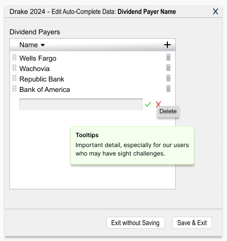
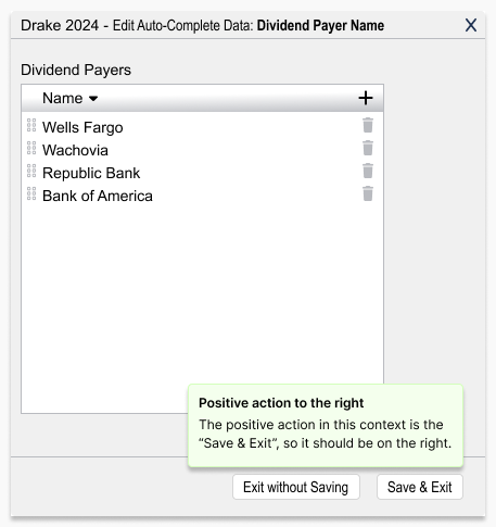
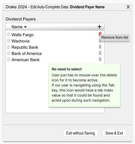
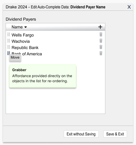
Below, I show the original screens with the issues called out, followed by my redesigned versions. When time allowed, I sanity-checked changes with quick prototype reviews with colleagues.
"Incremental improvements go a long way in helping to retain our dedicated user base."
— Drake Professional Product Team