Drake: New Sales & Renewals sites
Making annual software renewal fast enough that users barely notice it.
Drake Software offers existing users significant discounts for renewing their software immediately after the tax season ends.
For this initiative, I focused on three key objectives:
- Maintain Brand Consistency: Ensuring the design aligned with the established look and feel of the site
- Optimize Information Delivery: Displaying multiple products within the viewport without overwhelming the user
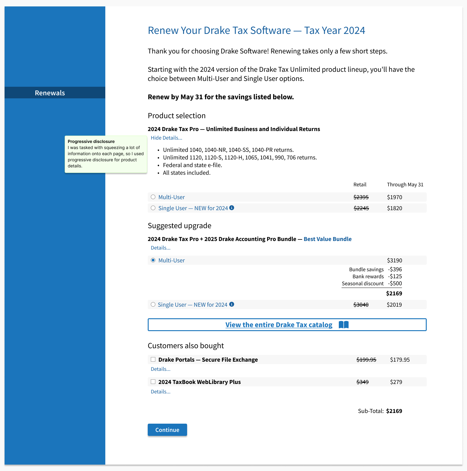
- Enhance Usability: Using progressive disclosure to present relevant information at the right time
My primary goal was to keep the page layout simple and remove friction from searching for and selecting renewal options, so users could complete the process quickly and confidently.
Key decisions
Outcomes
- Renewal conversion — Checkout completion was weak enough that the flow became a top priority ahead of renewal season. Progressive disclosure for selection and clearer discount presentation at the decision point. Sales funnel results during the renewal window (+11% new software, +8% renewals).
- Time to select — Users stalled when comparing bundles and navigating details. Consolidated options and surfaced a "same as last year" path. Confirmed through usability observations plus click path review.
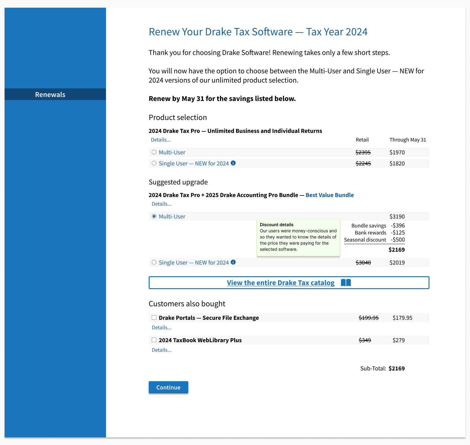
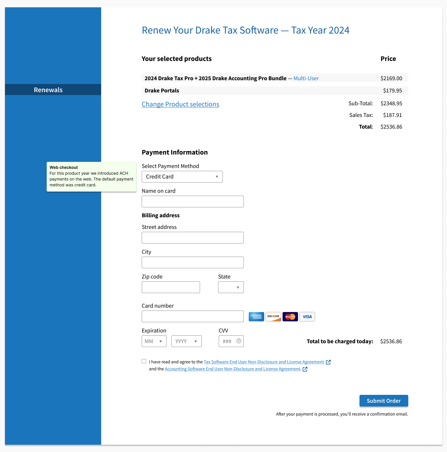
- Discount clarity — Users asked "what am I getting" questions before committing to checkout. Discount information moved inline where the decision is made. Short usability checks confirmed users could explain the offer before purchase.
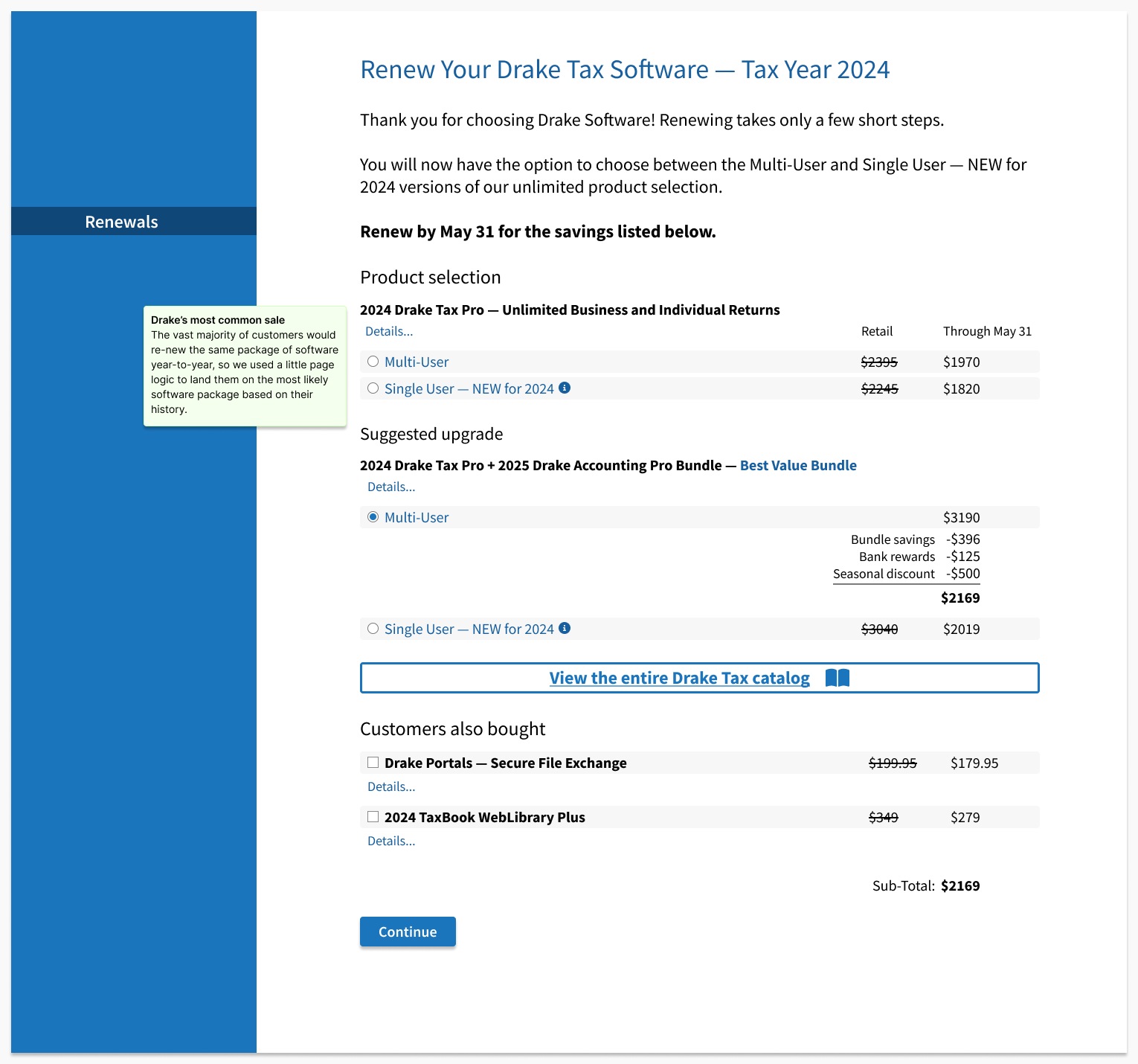
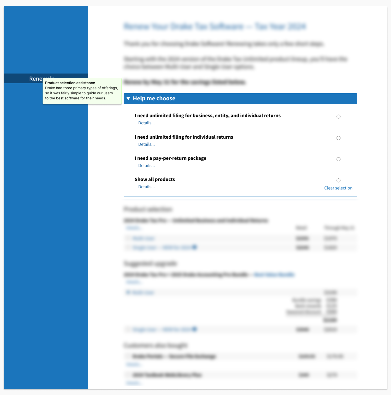
- Progressive disclosure replaced a flat product listing
- Discount information moved inline rather than living in detail screens
- The default renewal path surfaced the prior-year bundle for fast repeat renewal
Funnel analytics across the renewal window, supplemented by moderated usability sessions focused on selection and discount comprehension
I led design and research for the renewal flow, partnering with Product to prioritize the highest-friction steps.
We ran two short usability sessions with current Drake users, focused on two questions: could users find and select the right product without backtracking, and did they understand what discount they were receiving before committing to checkout? Sessions were informal and quick by design. Both produced immediate, actionable findings that fed directly into the final iteration before launch.
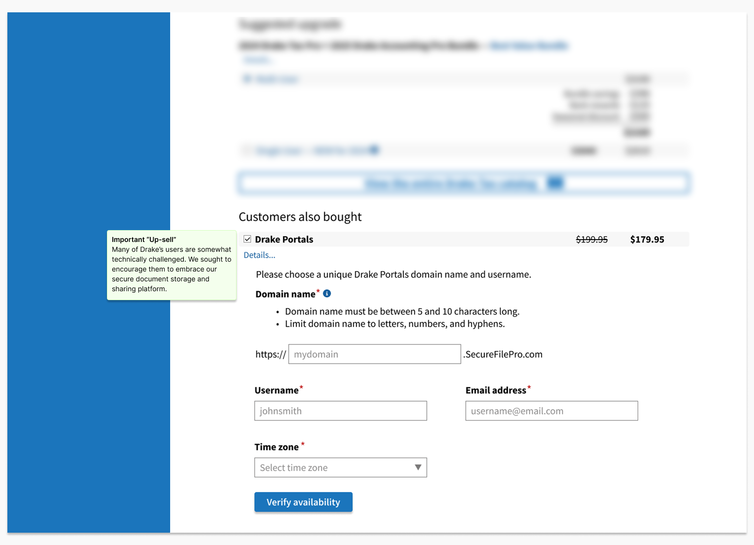
Two findings came up consistently across both sessions. The product details link, which triggered our progressive disclosure of specs and pricing, wasn't prominent enough. Users scanned past it without registering it as something to click. The same was true of the full catalog link, which was intended as an escape hatch for users who wanted to explore before committing, but read more like fine print than a navigation option. We addressed both before launch by making each link more visually prominent, ensuring they read as deliberate choices rather than secondary content.
"I just want the same software I had last year..."
— Drake Desktop Pro User