Drake: Mobile
Reframing what mobile should mean for tax professionals. And building a prototype to prove it.
There was genuine organizational enthusiasm for a Drake mobile app. The instinct behind it was sound: tax professionals are not always at their desks. They are meeting with clients, traveling between offices, fielding calls between appointments. A product that traveled with them was a reasonable thing to want.
The sticking point was what "mobile" was assumed to mean. The prevailing expectation was actual return access and viewing. That professionals should be able to view and work on tax returns from their phones. That assumption was worth challenging directly. A tax return is one of the most information-dense documents a professional handles. It is built for large screens, keyboard input, and extended, focused work sessions. Reproducing that experience on a phone would be a sub-optimal experience, to say the least.
The more useful question was: what do tax professionals actually need to do when they are away from their desks? The answer had nothing to do with returns. It was about the logistics and relationships that surround the work. Chasing a client for a missing document. Checking whether a submitted return has been acknowledged by the IRS. Remembering why a particular client was flagged last week. That is the work that happens in the gaps, and we had no good tool for this work.
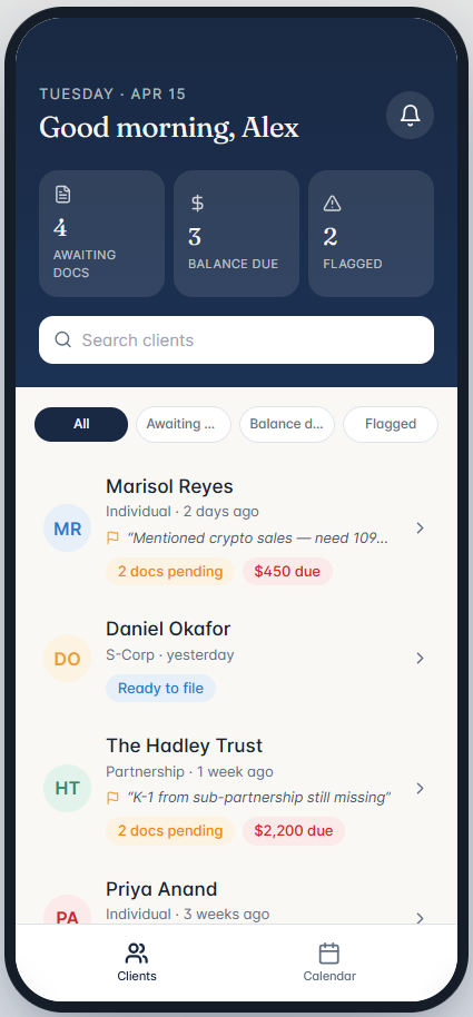
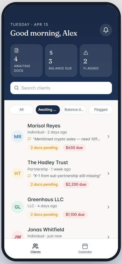
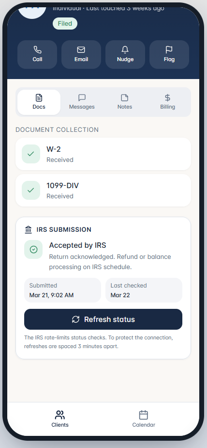
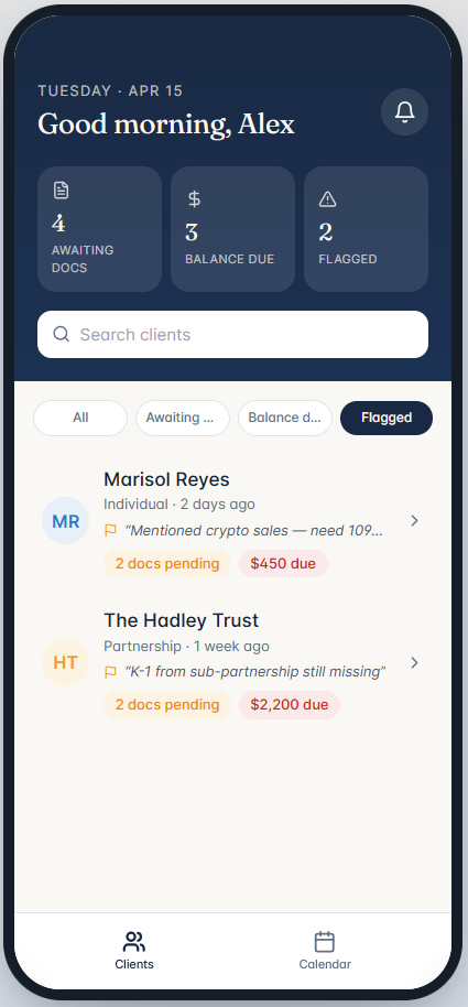
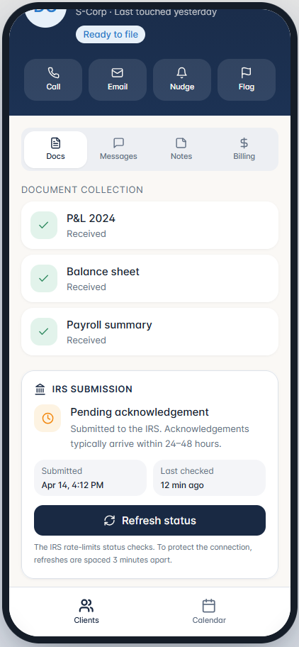
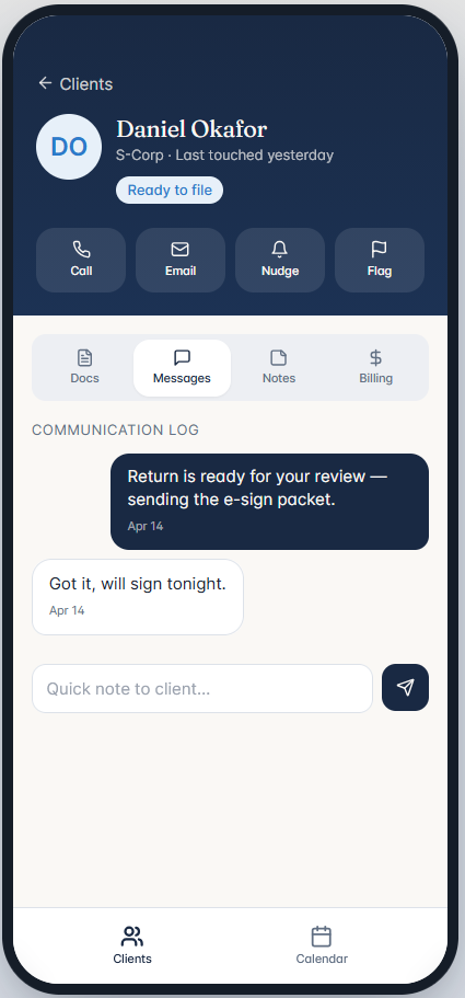
Rather than make that case in a presentation, I built screens. A working prototype is harder to argue with than a slide. The mockups below show what I believed the right mobile experience looked like: a client list with at-a-glance status indicators, document collection tracking, IRS submission status with rate-limited refresh, a flagged client view, and a lightweight communication log. The goal was to show a focused, purposeful tool, not a shrunken desktop.
Key decisions
- Direct-to-client push notifications when their return was accepted by the IRS, eliminating the follow-up call that pros make as a matter of routine.
- A master-detail view of IRS-flagged return issues: not full return access, but a quick, scannable summary of specific problems on a given return that required attention.
- A configurable refresh interval for submitted return status, so professionals could set a check frequency once and stop actively thinking about it.
"Where's my refund?" is the question every client asks and every tax pro dreads.
— Drake Tax Professional
Outcomes
- A working prototype changed the conversation — Slides, arguments, and justifications had not moved the needle on what mobile should mean for tax professionals. Walking stakeholders through an actual experience did. When they could see and interact with a focused, purposeful app rather than hear a case for one, the distinction between return viewing and relationship management became self-evident.
- Adjacent use cases defined and designed — Document tracking, IRS submission status, client flagging, and lightweight communication were identified as the core mobile value areas and prototyped end to end.
- Direct user feedback sharpened the vision — The Web Pilot study had already established a relationship with professionals who understood the domain deeply. Bringing the mobile prototype to that same cohort was a deliberate choice. The feedback they provided was not speculative; it came from practitioners who had lived the frustrations the prototype was designed to address. The three requests they surfaced pointed to specific gaps and gave the next iteration a concrete direction.
- Centering the mobile experience on adjacent tasks forced a parallel rethink of how those same tasks were surfaced in the evolving web product. If a professional needed to act on document status, submission tracking, or client flags from their phone, those same items needed to be visible and prioritized on the web as well.
- This created a genuine opening to explore a more purposeful landing experience for the web product. Not a dashboard in the traditional sense -- dashboards too easily become a clutter of disconnected widgets and performative busyness -- but something more considered: a structured, task-oriented surface that mapped to the same mental model as the mobile experience. The label mattered less than the idea, which was that the most actionable information should meet the professional immediately, on any platform.
This work was part of a longitudinal study designed to extend into the following tax season, a period one colleague memorably described as the time when our users act like martyrs. Quantitative measurement was not yet possible; the instrumentation to collect it had not been built. What we were gauging instead was directional: were professionals and stakeholders responding to the adjacent-tasks framing as the right one? The honest answer is that they were, and I am aware of how close that is to confirmation bias. The instinct had been that this was the correct direction, and the feedback we received supported it. The harder and more important next step was to move from instinct and enthusiasm toward instrumentation, building the capability into both the desktop and mobile products to collect real usage data and validate the decisions that had, until that point, been made on judgment alone.